 In this article, we will be dealing with another types of Android views. They are the RadioGroup, RadioButton, ProgressBar and AutoCompleteTextView. By learning the following views, it will broaden your understanding on android views that will help you build your own android application.
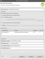
Lets start by creating a new android project on eclipse. See the screenshot beside for android project specifics.
RadioGroup and RadioButton
This two views is basically used to let users choose something among available options. RadioButton has two available states. It is either checked or unchecked. Once a RadioButton is checked, it cannot be unchecked unless its grouped along with other radio button on a RadioGroup. A RadioGroup is a type of view that is used to group one or mmore radio buttons, thereby allows a user to select only one radiobutton or only one option.
Create new android xml named basicviewspart2.xml under res/layout folder then put the following code:
<?xml version="1.0" encoding="utf-8"?>
<LinearLayout
xmlns:android="http://schemas.android.com/apk/res/android"
android:layout_width="wrap_content"
android:layout_height="wrap_content">

<RadioGroup android:id="@+id/colorOptions"
android:layout_width="fill_parent"
android:layout_height="wrap_content"
android:orientation="vertical"
>

<RadioButton android:id="@+id/red"
android:layout_width="fill_parent"
android:layout_height="wrap_content"
android:text="Red"
/>
<RadioButton android:id="@+id/blue"
android:layout_width="fill_parent"
android:layout_height="wrap_content"
android:text="Blue"
/>
<RadioButton android:id="@+id/green"
android:layout_width="fill_parent"
android:layout_height="wrap_content"
android:text="Green"
/>

</RadioGroup>
</LinearLayout>
Then, update BasicViewsPractice.java by adding the following codes:
package com.app.techie;

import android.app.Activity;
import android.os.Bundle;
import android.widget.RadioButton;
import android.widget.RadioGroup;
import android.widget.Toast;
import android.widget.RadioGroup.OnCheckedChangeListener;

public class BasicViewsPractice extends Activity {
    /** Called when the activity is first created. */
    @Override
    public void onCreate(Bundle savedInstanceState) {
        super.onCreate(savedInstanceState);
        setContentView(R.layout.basicviewspart2);

        RadioGroup colorChoices = (RadioGroup) findViewById(R.id.colorOptions);
        colorChoices.setOnCheckedChangeListener(new OnCheckedChangeListener() {

            @Override
            public void onCheckedChanged(RadioGroup group, int checkedId) {
                RadioButton redOption = (RadioButton) findViewById(R.id.red);
                RadioButton blueOption = (RadioButton) findViewById(R.id.blue);
                RadioButton greenOption = (RadioButton) findViewById(R.id.green);

                if(redOption.getId()==checkedId){
                    displayToast("You selected red!");
                }

                if(blueOption.getId()==checkedId){
                    displayToast("You selected blue!");
                }

                if(greenOption.getId()==checkedId){
                    displayToast("You selected green!");
                }
            }
        });

    }

    private void displayToast(String message){
        Toast.makeText(getBaseContext(), message, Toast.LENGTH_SHORT).show();
    }
}
Briefly, the code above simply display a message through Toast. the message indicates what option a user selects. We identified the radiobutton selected using its IDs. The above should look like:
ProgressBar
This view is usually used to indicate that an event, task or an activity is currently ongoing. An example of which is downloading files where progress of download is shown visually though a color bar. This is a good choice to tell the user about the status of the task. For us to understand it better, lets do the activity below.
Lets use same activity created above and update the basicviewspart2.xml by adding the following code:
<ProgressBar
android:id="@+id/normalProgressBar"
android:layout_width="wrap_content"
android:layout_height="wrap_content"
android:visibility="gone"
/>
<Button android:id="@+id/btnDownload"
android:layout_width="wrap_content"
android:layout_height="wrap_content"
android:text="Download"
/>
On our xml code, we added two views. A progress bar with visibility default to gone so at startup it does not appear on display and a button to do some work or task on background. What we want to do is to simulate progress bar. So, if the user clicks the button, a task is started and the progress bar will display and hide when the task is done.
Update BasicActivityPractice.java to look like this:
package com.app.techie;

import android.app.Activity;
import android.os.Bundle;
import android.os.Handler;
import android.view.View;
import android.widget.Button;
import android.widget.ProgressBar;
import android.widget.RadioButton;
import android.widget.RadioGroup;
import android.widget.Toast;
import android.widget.RadioGroup.OnCheckedChangeListener;

public class BasicViewsPractice extends Activity {
    private static int progress = 0;
     private ProgressBar normalProgressBar;
     private int progressStatus = 0;
     private Handler handler = new Handler();


    /** Called when the activity is first created. */
    @Override
    public void onCreate(Bundle savedInstanceState) {
        super.onCreate(savedInstanceState);
        setContentView(R.layout.basicviewspart2);

        RadioGroup colorChoices = (RadioGroup) findViewById(R.id.colorOptions);
        colorChoices.setOnCheckedChangeListener(new OnCheckedChangeListener() {

            @Override
            public void onCheckedChanged(RadioGroup group, int checkedId) {
                RadioButton redOption = (RadioButton) findViewById(R.id.red);
                RadioButton blueOption = (RadioButton) findViewById(R.id.blue);
                RadioButton greenOption = (RadioButton) findViewById(R.id.green);

                if(redOption.getId()==checkedId){
                    displayToast("You selected red!");
                }

                if(blueOption.getId()==checkedId){
                    displayToast("You selected blue!");
                }

                if(greenOption.getId()==checkedId){
                    displayToast("You selected green!");
                }
            }
        });

        normalProgressBar = (ProgressBar) findViewById(R.id.normalProgressBar);
         Button download = (Button) findViewById(R.id.btnDownload);
         download.setOnClickListener(new View.OnClickListener() {
             @Override
             public void onClick(View v) {
                 //show the progress bar
                 normalProgressBar.setVisibility(0);
                 simulateProgress();
             }

             private void simulateProgress() {
                 progress = 0;
                 progressStatus = 0;
                 //do some work in background thread
                 new Thread(new Runnable()
                 {
                     public void run()
                     {
                         //do some work here
                         while (progressStatus < 10)
                         {
                             progressStatus = doSomeWork();
                         }

                         //hides the progress bar
                         handler.post(new Runnable()
                         {
                             public void run()
                             {
                                 //0 - VISIBLE; 4 - INVISIBLE; 8 - GONE
                                 normalProgressBar.setVisibility(8);
                             }
                         });
                     }

                     //do some long lasting work here
                     private int doSomeWork()
                     {
                         try {
                             //simulate doing some work
                             Thread.sleep(500);
                         } catch (InterruptedException e)
                         {
                             e.printStackTrace();
                         }
                         return ++progress;
                     }

                 }).start();
             }


         });

    }

    /**
     * Helper method to display message
     * @param message
     */
    private void displayToast(String message){
        Toast.makeText(getBaseContext(), message, Toast.LENGTH_SHORT).show();
    }
}
The above code retrieves the progress bar we added to layout earlier as well as the button. When the button is clicked, the progress bar visibility is changed to visible mode and a background task simulation took place wherein upon its done, the visibility of the progress bar is changed back to gone. By the way, there are three representations of visibility - 0 for visible, 4 for invisible, and 8 for gone. The activity should look like below.
Moreover, ProgressBar has an attribute style wherein you can change its display. Instead of intermediate mode style like above, you can use a horizontal bar. Take note of the code:
<ProgressBar
android:id="@+id/normalProgressBar"
android:layout_width="wrap_content"
android:layout_height="wrap_content"
android:visibility="gone"
style="?android:attr/progressBarStyleHorizontal"
/>
And then change your activity class code in method simulationProgress() to:
//do some work here
while (progressStatus < 100)
{
   progressStatus = doSomeWork();

   //Update the progress bar
    handler.post(new Runnable()
       {
          public void run() {
            normalProgressBar.setProgress(progressStatus);
          }
       });

}
The result should be like:
AutoCompleteTextView
It is a subclass of textview only that it has an auto complete suggestion feature. Think of a textbox while typing and under it is keyword suggestions. This basically helps you reduce the typing effort and typo error.
What we are going to do first is update the android layout xml by adding an autocomplete textview:<AutoCompleteTextView
android:id="@+id/txtFriends"
android:layout_width="fill_parent"
android:layout_height="wrap_content"
/>
Afterwards, we add code to our activity class inside onCreate method:
final String[] friends = {
                "Jose Rizal",
                "Britney Spears",
                "Sarah Walker",
                "Sarah Jane",
                "Brook How",
                "Kimberly Some",
                "Kimkrek Shoo"
        };
        ArrayAdapter<String> adapter = new ArrayAdapter<String>(this,android.R.layout.simple_dropdown_item_1line, friends);

        AutoCompleteTextView txtFriend = (AutoCompleteTextView) findViewById(R.id.txtFriends);
        txtFriend.setThreshold(3);
        txtFriend.setAdapter(adapter);
Understanding the code above: We made an array of string where its value will be the value suggested to the user. It is feed into an ArrayAdapter object where the auto complete textview can obtain suggestions. If you notice, we also set threshold to 3. Threshold is used to set the minimum characters before suggestions appear as a drop-down menu. Try running the application and it should look like:
Nutshell
Finally, we are donw with those another three kind of useful Android views. In this tutorial we've learned more basic on views. Another article is coming up taking up more views so stay tuned. Hope this article helps you.


